Imagine sitting in a room coloured entirely in red.
Chances are high that you will feel agitated, perhaps with a little anger or hunger.
Why? Because colour matters.
Colour in the classroom certainly matters. Research demonstrates that specific colours influence the morale, emotions, behaviour, and performance of learners.
Colour impacts students’ eye strain, degree of stimulation, and level of concentration. Learn more about the psychology of colours and how you can apply these in your classroom design.
Overview of Colour Theories and Research
A school’s physical environment impacts its students in powerful psychological and physiological ways.
According to the International Association of Colour Consultants – North America (IACC-NA)
“Appropriate colour design is important in protecting eyesight, in creating surroundings that are conducive to studying, and in promoting physical and mental health.”
Incorrect environmental conditions with poorly planned colour and lighting directly contribute to many cases of irritability, premature fatigue, lack of interest and behavioural problems
Physiological Effect of Colour
In 1979, Dr. Alexander G. Schauss presented his findings on the scientific basis for colours’ effect on humans: “Colours are electromagnetic wave bands of energy.
Each colour has its own wavelength. The wave bands stimulate chemicals in your eye, sending impulses of messages to the pituitary and pineal glands near the brain.
These are the master endocrine glands that regulate hormones and other physiological systems in the body. Stimulated by response to colours, glandular activities can alter moods, speed up heart rates and increase brain activity.”
Colours cause different physiological responses in blood pressure, heart rate, respiration, digestion, body temperature, and brain activity. The different wavelengths of colours impact even blind people, as confirmed by neuropsychologist Kurt Goldstein.
Colour affects emotions and feelings, with a direct connection between the brain and the body. Reactions to colour occur without thought. The relationship between colour and emotion is closely related to colour preferences, as well as cultural and social influences.
Age Group Differences
When designing optimal learning environments, you must be sensitive to each age group’s different colour preferences and different responses to colours.
Research by the Institute of Colour Psychology found the following colour preferences for different ages:
- Most children do not prefer black, white, grey, and brown
- 5- to 8-year-olds prefer red, orange, yellow, and violet
- 9- to 10-year-olds prefer red, red-orange, and green-blue
- 11- to 12-year-olds prefer green and yellow
- 13- to 14-year-olds prefer blue, ultramarine, and orange
Different age groups relate better to different colour schemes:
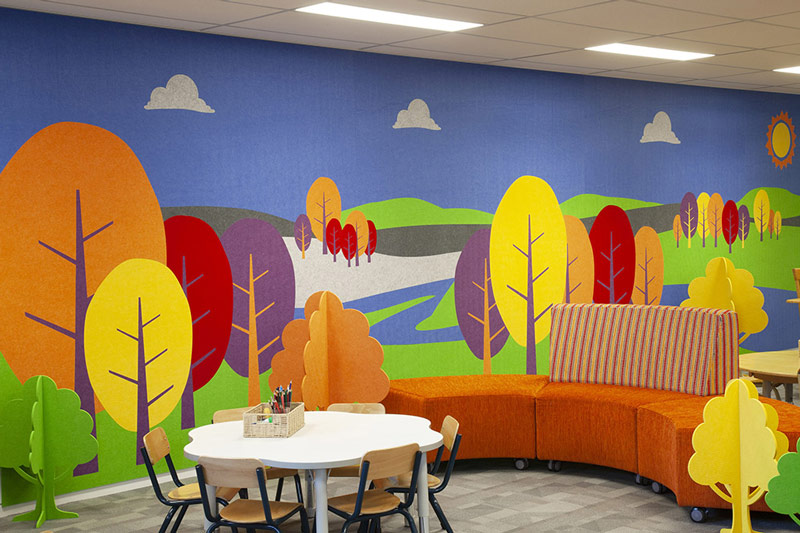
Pre-school and younger primary school learners work well in bright and warm colours, like red, yellow, and orange.
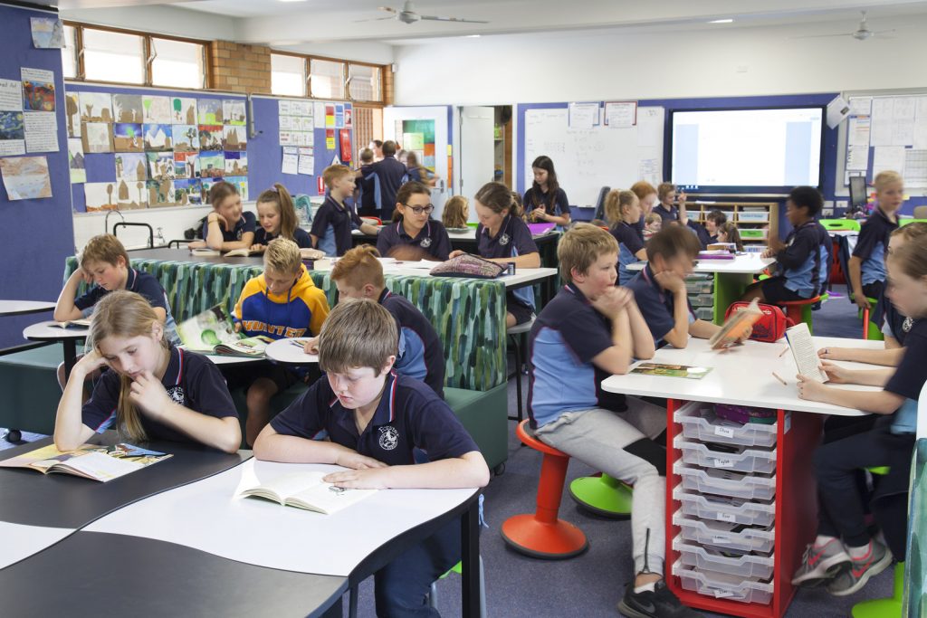
Older primary school learners typically consider primary colours (red, yellow, and blue) to be immature, and they tend to prefer cooler colours and more subdued hues. They seem to work better with tints and pastel shades of colour on a main classroom walls, floors, and ceiling.
Adolescents relate better to cool colours, which relax and focus learners’ concentration.
Where and Why to Use Certain Colours
You should approach colour choices in classroom design as a functional matter rather than just from an aesthetic standpoint. A functional colour focus uses colour to achieve an end result such as increased attention span and less eye fatigue.
When selecting colours the nature of the task is relevant. For example, when concentration is the goal, it can be assisted through the use of different colours. Or, the art section of a classroom can apply colours that stimulate creativity. Use the focal point of each activity setting, such as reading, motor play, etc., to guide colour choices.
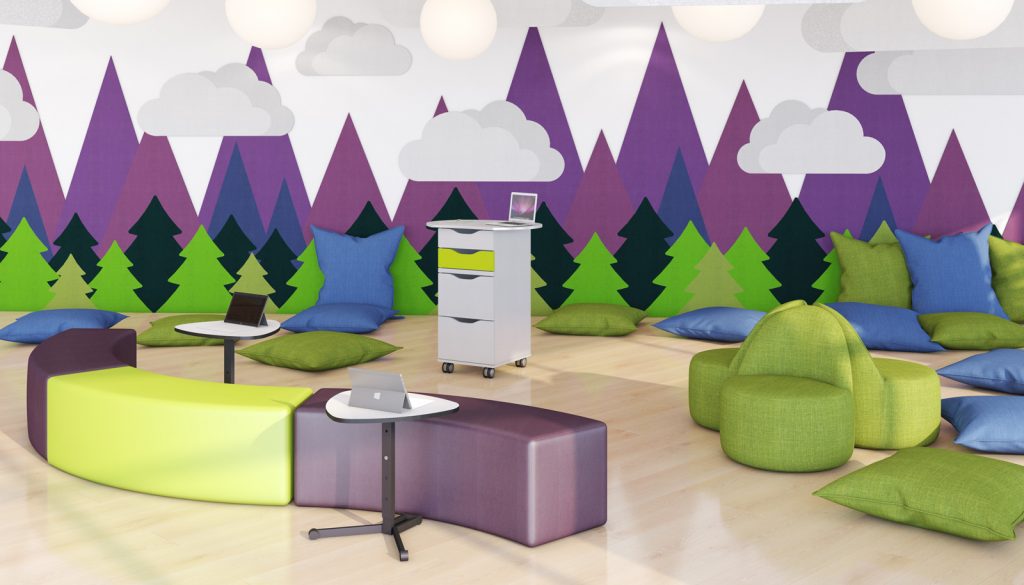
Classroom design and colour schemes include more than just paint on the walls. Colours can be used as accents on classroom furniture as well.
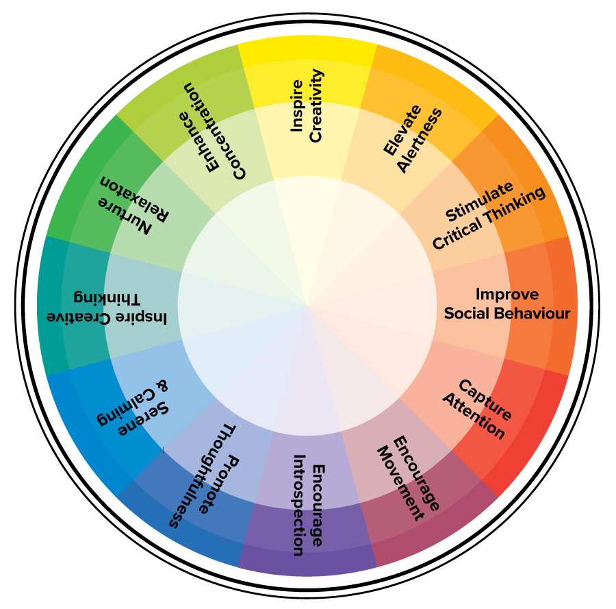
Greens
- Enhance concentration
- Nurture relaxation
- Inspire creative thinking
Pale or light green would be a good choice for libraries or reading areas, where quietness and concentration are needed.
A medium-toned green would work well as the wall colour at the front of a classroom. Green also would be a good choice for creative writing. Green is recommended in colour schemes for children aged 10 to 12.
Blues
- Calming
- Promote thoughtfulness
- Encourage introspection
Shades of blue work well for walls and furniture of reading areas, where students need to focus on what they are reading rather than activity around them.
Medium-toned blue also works well at the front of the classroom, where it relaxes students’ eyes. Blue is a good choice in colour schemes for adolescents.
Reds
- Capture attention
- Encourage movement
- Promote alertness
Red is useful for drawing attention to certain areas. Some red would be a good inclusion in preschool and younger primary school classrooms, since it is an energetic colour that works well with young children’s extroverted89
nature.
Oranges
- Improve social behaviour
- Cheer the spirit, and lessen hostility and irritability
- Stimulate critical thinking and memory
Orange is similar to red in its effects, though it is less stimulating.
Yellows
- Inspire creativity
- Elevate alertness
- Encourage spontaneity
Light yellow provides a suitable background for art studios and areas of creative activities.
Yellows appeal to very young children, and this colour often appears in early primary school colour palettes.
Neturals
Neutral (whites, beige, timber)
Warmer neutral colours, though, can provide a foundation for walls and ceilings that allows teachers flexibility in adding appropriate brighter accent colours.
White walls are proven to result in negative psychological effects, such as anxiety, disruptive behaviours, lack of focus, and depressive moods.
Recommended Combinations of Colours
Though use of multiple colours reduces monotony, no more than six colours should be used.
More colours in a learning environment tends to strain the brain’s cognitive abilities.
Overuse of colours also leads to negative consequences.
For example, too much blue can be depressing, and though yellow generally inspires cheerfulness and creativity, too much exposure to yellow can produce stress.
Extensive use of bright, energetic colours like red, orange, and yellow can overstimulate.
Thus, balance is key to the selection and combinations of colours in the classroom.
When incorporating colour into classroom design, use the following as guidance.
Classroom Walls
Many professionals recommend painting the wall behind the teacher a different colour from the other walls.
The main teaching wall, which is where students face much of the time, should be in a medium tone of green or blue.
This serves multiple purposes:
- To relax students’ eyes
- Promote concentration
- Draw attention to the front of the room
- Provide effective contrast to the chalkboard and teaching materials
Side and back walls should use subtle hues that enhance the ability to concentrate. Suitable colours include beige, sandstone, light tan, pale green, or light green.
Use of Contrasts
For most students, high contrasts are stimulating, and lighter tones promote focus.
Monotonous colour schemes under-stimulate, and at least one study found monotonous colours led to increased absenteeism.
Thus, the learning environment should incorporate a variety of colours in a range of intensity.
Bright colours could be used on classroom furniture. Furniture does not use large expanses of colour, so adding intense colours to furniture pieces can be effective without overstimulating.
For example, use red and orange on shelves or chairs to attract students’ attention to various areas of the classroom.
Use of Contrasts
Overall, most studies have found that softer tones of primary and secondary colours, such as yellow, blue, red, green, and orange, tend to work better in schools or learning environments.
Effect of Colour Use on Learning Outcomes
Effective use of colour, based on age, subject, and activity, helps create an environment that stimulates learners’ educational experience and impacts learning outcomes in several ways.
Much research exists on the colour impact on youth’s activities and learning:
Engelbrecht (2003) found that the colour of classroom walls affects productivity and accuracy.
Brubaker (1998) reported that cool colours permit better concentration.
In a study by Bross and Jackson (1981) the children made fewer errors when working in cubicles painted in their preferred colour. Well-liked colours have a positive effect on muscle tension as well as motor control skills.
One study found that use of students’ more popular colours of light blue, yellow, yellow green, and orange, could raise IQ by as much as 12 points over use of white, black, and brown, colours considered ugly.
The popular colours also stimulated alertness and creativity, while the unpopular colours made children less attentive.
Sinofsky and Knirck (1981) found that colour influences attitudes, behaviours, and learning of students in part because colour affects a student’s attention span and affects students’ and teachers’ sense of time.
According to their research, the colour of a classroom can affect the degree students are able to absorb information.
In addition to the various effects discussed above, colour affects student learning in the following ways:
Use of colour enhances brain development through visual stimulation, which makes stronger connections in the brain while fostering visual thinking, problem solving, and creativity.
Use of a variety of colours reduces boredom and passivity, improving attention span by avoiding a monotonous environment.
Using colours in the classroom helps students stay focused through mental stimulation, which in turn increases productivity and accuracy.
Colours, like red and orange, affect blood pressure and heart rhythm, increasing the attention span of children, which then in turn benefits their learning.
Numerous studies have demonstrated the ability of colour to impact blood pressure, including a Wohlforth and Sam (1982) study that observed a reduction in blood pressure and aggressive behavior, even in visually-impaired children, after a change to colours used in their environment.
Colour psychology should be incorporated into your pedagogy and your classroom designs, since students’ environment impacts their ability to learn, as does curriculum and teaching methods.
References
“Coloring the Classroom.” School Planning & Management, December 2013, webspm.com/Articles/2013/12/01/Coloring-the-Classroom.aspx.
Rhinehart Neas, Linda M. “The Use of Color in Kindergarten Classrooms.” Bright Hub Education, www.brighthubeducation.com/teaching-elementary-school/121471-the-importance-of-color-in-kindergarten-classrooms/
Daggett, Dr. Willard R.; Cobble, Jeffrey E.; Gertel, Steven J. “Color in an Optimum Learning Environment.” International Center for Leadership in Education, March 2008, williammeurer.com/wp-content/uploads/2017/09/Color-in-Learning-Environment-W.-Dagget-2008.pdf.
Barrett, P.S.; Zhang, Y. “Optimal learning spaces: design implications for primary schools.” October 2009, Optimal learning spaces: design implications for primary schools (worktribe.com)
“Functional Color and Design in Education Environments.” Architectural Record, August 2014, CE Center – (bnpmedia.com)
Grube, Kathryn J. “Detrimental Effects of White Valued Walls in Classrooms.” Educational Planning, vol. 21, no. 2, 2014, eric.ed.gov/?id=EJ1208594
Barrett, P.; Davies, F.; Zhang, Yufan; Barrett, L. “The impact of classroom design on pupils’ learning: Final results of a holistic, multi-level analysis.” Building and Environment, vol. 89, July 2015, sciencedirect.com/science/article/pii/S0360132315000700.